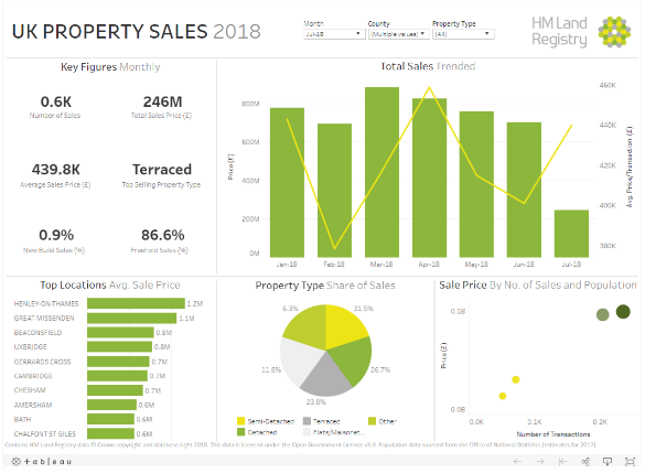
I’m relatively new to the world of data visualisation – but, I’m delighted to say, I’m already a prizewinner!
I entered MeasureCamp’s Data Viz Wiz competition at the suggestion of my manager at Discovery Inc, where I was working as a Digital Analyst over the summer.
Sponsored by HM Land Registry, the competition challenged us to present land registration data in original and stimulating ways. I thought it would be a great chance to practise visualisation skills and work with more varied datasets.
My current master’s degree in maths and physics at Bath University had provided the opportunity to spend 12 months working in industry, which opened me up to the world of digital analytics and data visualisation.
I was lucky enough to get a role as an intern at The Walt Disney Company, using tools such as Adobe Analytics and Tableau to collect and present data on the company’s websites and apps. At Discovery Inc I was able to develop my skills and work with numerous new tools including Power BI.
The HM Land Registry competition data was very different to the digital data I was used to and provided the perfect opportunity for me to build new visualisations and adapt the techniques I had learnt in my previous roles.
Creating my visualisation
To create my visualisation I used the Price Paid dataset and merged it with population estimates from the Office for National Statistics. I chose this data since it appeared to be the most relevant and interesting to me. It gave me the ability to compare the price of land sales in areas I know well across the UK and I even recognised some of the transactions.
The dataset included a large range of sales, from terraced houses to multi-million-pound mansions, and it was very interesting to delve into the patterns of these sales. In addition, the data gave me the opportunity to use a range of visuals and filters which enable the users to interact and understand the patterns in areas important to them.
When creating the visualisation I encountered a few key challenges. The first came when trying to understand and manipulate the format of the data. With an entirely new dataset I initially found it hard to identify the meaning of each component and it took some time for me to gain enough understanding in order to produce meaningful visuals. Once I had grasped the meaning of the data and identified the key dimensions and variables I would be using, I then had to spend some time manipulating the columns to enable my final output be as user friendly as possible.
The next challenge came when choosing the visuals I would include. Such a diverse dataset gave me the option of using a range of visuals. However, with limited space on the dashboard it was crucial that I only used those most informative to the user which took some time as I considered the audience it was intended for.
Finally, the data had a very high granularity – drilling down the whole way to postcode and house number. However, in order to identify informative trends I had to make a decision on where to limit the depth available to the user. Eventually I decided that using counties and cities would be of most interest to users hoping to explore the property sales in their local areas or areas in which they are looking to purchase themselves.
I’m so pleased to have won! As someone still relatively new to data visualisation it is incredibly exciting to be able already to create informative and impactful visualisations using tools such as Tableau. Now that I’ve returned to university – and training to run the London Marathon in support of eating disorders charity Beat in April – I’m looking forward to learning more about data analysis and visualisation and can’t wait to make the most of the prize.
Thank you, MeasureCamp and HM Land Registry!

1 comment
Comment by David posted on
Great explanation of the process of creating useful visualization of Land Registry data.